
Weekly Perspective: Mind the Raptor Gap

During the 1980’s, angst about the U.S. falling behind the U.S.S.R. in military superiority ran high, despite signs for decades that the Soviet military spending and capability was being severely constrained by its faltering domestic economy. Regardless, major U.S. military investments and development programs raged on into the twilight hours of the Cold War. Many of these development programs were sparked by weak U.S. intelligence that overestimated the Soviet’s own technological capabilities. One of these development programs was the F-22 Raptor, a stealth air superiority fighter jet. When the Iron Curtain fell in 1989, it became apparent that the F-22’s expensive technology was far and beyond the Soviet capabilities. The U.S. essentially accelerated military technology spending right into the end of the war (and ended up having to cut spending and production materially on the other side, creating disruption for the defense industry). There are two interpretations of this: large U.S. spending at the end of the Cold War was necessary to bring the Soviet adversary to its knees, OR U.S. spending into the end of the Cold War was profligate, based on unfounded fears, and ended up causing disorder as it was wound down. We find ourselves in a similar debate today.
Over the past month, a debate has been raging in economic circles about the “right” amount of stimulus to inject into the U.S. economy in order to combat the impacts of the pandemic. There is a deep schism between the “go big”/$1.9T/inflation-is-not-a-near-term-concern camp and the smaller-&-targeted-relief/inflation-risks-loom-on-the-horizon camp. At first the division revolved around fairly theoretical/hypothetical debates: how to even measure “too much” (are output gaps a useful tool for making projections on inflation) and should the spending be classified as “stimulus” or “relief”? But then, stronger economic data rolled in over the past two weeks (U.S. retail sales +5.3% vs. 1% cons on the back of the $600 stimulus checks; higher producer price inflation, etc.), apparently bringing real-time empirics to the debate and sparking the $20T U.S. Treasury market to weigh in (we have seen a meaningful sell-off in long dated U.S. Treasury bonds, meaning yields higher and curve steepening, as higher deficit spending and inflation fears are “priced in”).
First, there is an acknowledgment on both sides of the debate that the austerity-loving, deficit-fearing response to the GFC was not enough and contributed to the slow pace of the subsequent recovery. This is leading members of the go-big camp, like Janet Yellen, to argue that “price of doing too little is much higher than the price of doing something big” (see Yellen interview here). The go-bigger’s argue that inflation is not a concern, seeing a repeat of 1970’s style inflation/stagflation as highly unlikely given globalization, demographics, technology, and lack of labor bargaining power (see NYT opinion piece here). The Fed majority supports this view, with their incredulity that the near term uptick in inflation will prove to be anything but transitory (see FT article here), while they still see signs of weakness in the U.S. economy (see WSJ article here about recent Fed minutes).
Despite their acknowledgment that the GFC response was not enough, the go-smaller’s are concerned that the size of the Biden stimulus of $1.9T, plus the December 2020 bill of $900B is way too large for an economy that is already well on its way to recovery. The go-smaller’s rely on an output gap argument, with the output gap being the difference between actual and potential GDP in the economy (i.e. how much GDP could the U.S. economy produce if the pandemic recession had not happened, see recent Congressional Budget Office estimates here). Go-smaller’s see the output gap as being much smaller than the amount of stimulus being proposed, creating a high risk of “overheating” (see Larry Summers article here, see Oliver Blanchard’s tweets here, see Oliver Blanchard’s article here). They estimate that the amount of stimulus that the new Biden proposal would add to the economy each month is at least 3-times the size of the output gap, or simply too much and thus inflationary.
Go-smaller’s are also concerned with the rapid rise in government spending as a percentage of GDP (see Jeffrey Gundlach here pointing out that the $8.1T of government spending in the last 12 months equals 40% of GDP). They see the rapid recovery of economic data that is well underway, plus the high-flying stock market as indicators that a doubling down on stimulus now could create long-term financial stability issues (see Jeremy Grantham interview here, see Michael Burry’s tweets here). They ask if the U.S. economy needs this degree of additional support given existing stimulus, elevated personal savings still to be worked down ($1T above pre-COVID levels), public asset markets in an ebullient state (high valuations, low cash balances, high exuberance, high trader leverage), tight supply chains (producer price inflation highest since 2009), and indications of resilient consumer demand (retail sales strong, goods demand well above pre-COVID levels, house prices running +11% YoY).
Of course, there is pushback if the output gap is even the right metric to use by the go-bigger’s (see Krugman article here). The output gap is difficult to measure/estimate, while the CBO has frequently revised down its output gap measure and underestimated the size of the gap (see Business Insider article here) and there are only weak links of the output gap to inflation in recent years. Krugman also argues that further spending should not be considered “stimulus” but instead “disaster relief”, also likening it to war spending: “And when you’re fighting a war, you don’t decide how much to spend by asking how much stimulus you need to close an output gap; you ask how much you need to spend to achieve victory.”
And here we are back at the Cold War parallel: do you spend as much as you possibly can to bring the pandemic to its knees (i.e. building F-22 Raptors) or do you taper off spending if the end of the war is in sight? Certainly a “peace treaty” looks closer than it has ever been during these pandemic times: infection rates are easing in the U.S., while President Biden is projecting that all Americans will have access to the vaccine by July.
Knowing who is right or wrong in this debate is not the point for investors because it is not what should be done that matters for asset prices but what actually gets done.
The size of the bill is important for asset prices: loosely, the larger the bill the more likely we will see continued near-term upward pressure on long-term interest rates (hurting long term bond returns) and downward pressure on the dollar. This would favor Value oriented equity sectors. A smaller bill could reignite the downtrend in U.S. interest rates, allow the USD to move higher, and possibly favor Growth oriented equity sectors.
For what it’s worth, Growth stocks have been underperforming Value stocks since September of 2020, which coincides with the bottoming of US 10 Year Real Interest rates (Chart 1). Recall there has been a tight relationship between Growth/long-duration/tech stock valuations and real interest rates (Chart 2). The trend of sharp Growth outperformance over Value looks to be over, with a break in the uptrend in November and now in a range of lower-highs and lower-lows. It appears that the market is expecting more stimulus not less.
Chart 1: Growth (RLG) vs. Value (RLV) & US 10 Year Real Interest Rate (inverted, red line)
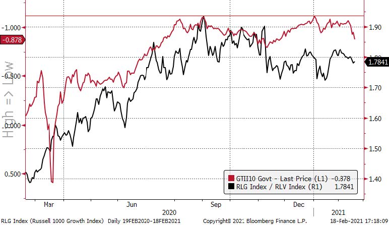
Source: Bloomberg, Fieldpoint Private
Chart 2: NASDAQ Comp P/E Ratio (red) & US 10 Year Real Interest Rate (black, inverted); through 12/31/20);
The green circle shows the “Powell Pivot” which signaled that the tightening cycle was over and led to a collapse in real yields and a sharp move higher in tech/long-duration valuations
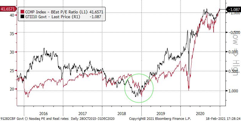
Source: Bloomberg, Fieldpoint Private
Chart 3: Growth (RLG) vs. Value (RLV)
Broke the uptrend of Growth outperforming Value in November of 2020 and now in a range of lower-highs and lower-lows
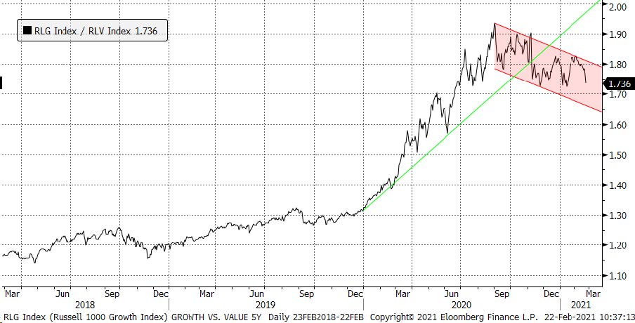
Source: Bloomberg, Fieldpoint Private
Last Week in Markets: Equities Mixed and Upside Challenges; Long Bond Sell-Off Leads to Ambiguity; Copper Rallies
Equities
U.S. large cap equities indices were mixed on the week (S&P 500 -0.25%, NASDAQ -1.08%, Down Jones Industrial Average +0.20%). Smaller cap indices were negative on the week (Russell 2000 Small Cap -0.82%; S&P 400 Mid Cap -0.36%). Notably, Growth (-1.22%) lagged Value (+0.79%) last week.
The outperformance of Value vs. Growth was driven by dispersion in sector performance. Value heavy sectors Energy (+4.5%), Financials (+3.78%), Materials (+1.92%), and Industrials (+1.42%) were the leaders of the week. Stronger earnings and macro tailwinds (higher interest rates/steeper yield curve, higher commodity prices) helped these value sectors, notably with Banks +7.02% (bringing the YTD rally in banks to +16.31%). Conversely, higher interest rates weighed on defensive/higher yielding sectors: Utilities (-2.76%), Consumer Staples (-0.98%), and Real Estate (-0.83%). Technology (-1.44%) also lagged due to weakness in the Software industry group (-1.37%).
Earnings season moved toward its end, with 83% of S&P 500 companies how having reported earnings. 79% of companies have beat EPS estimates, with an aggregate beat rate of 14.6% (the fourth highest on record). EPS growth on a YoY basis is now running at positive +3.2% vs. an expected decline of -9.3% on 12/31/20. As we have continued to note each week, the share price reaction to these beats has been muted overall, with an average price reaction two days before and after the earnings release of -0.1%, significantly below the 5-year average of +0.9% (see Chart 4, see FactSet article here).
Chart 4: S&P 500 Positive EPS Surprises
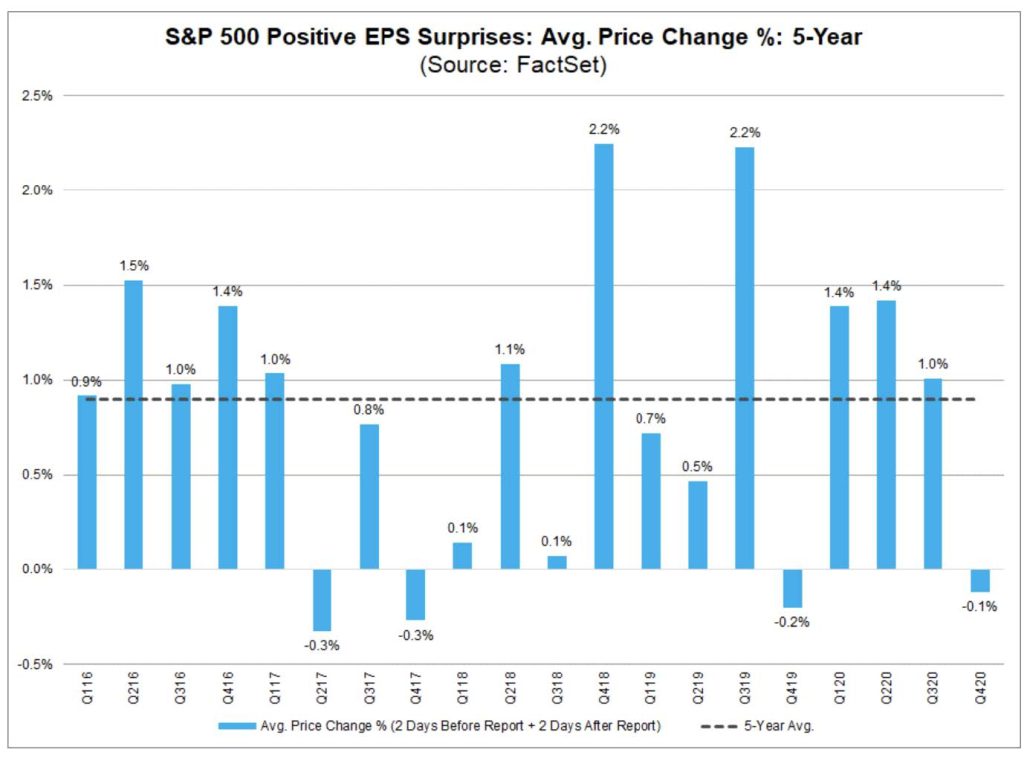
Source: FactSet
Note the weak share price reactions to strong earnings in 4Q17 and 4Q19 earnings season (reporting in February of 2018 and 2020, respectively) and the further weak stock market performance that followed in the spring of 2018 and 2020. This of course could be spurious and more reflective of exogenous variables (Fed tightening in 2018, pandemic in 2020), but as we noted in this Earnings High Jumps piece from a month ago, weak share price reactions to big earnings beats can be reflective of investor expectations that have gotten ahead of themselves. As we described in our 2021 Outlook, with valuations for the S&P 500 near prior-bubble highs and earnings growth expectations already robust (40% growth in 2021, 16% growth in 2022, and 11% growth in 2023), the bar is already set very high to surprise to the upside. See the following two charts (Chart 5 and 6, from Julien Bittel of Pictet) that capture this combination of high valuation and high earnings expectations. This makes further large gains in the S&P 500 from these levels either difficult to achieve or firmly reflective of bubble conditions.
Chart 5: U.S. Valuations above the 98th Percentile
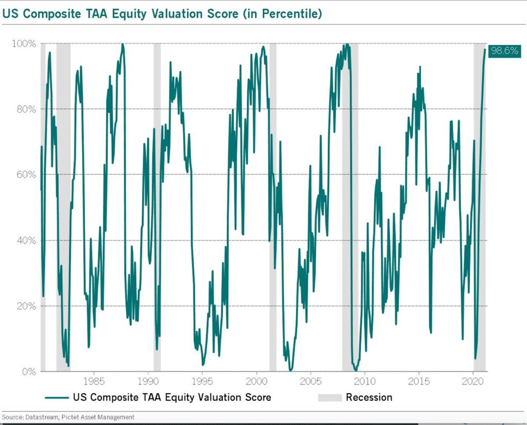
Source: Julien Bittel, Pictect Asset Management
Chart 6: Long Term EPS Growth Expectations Have Skyrocketed
This is partially base effect from a weak 2020, but also reflects the Street expectations for strong EPS growth to continue in the next 3-5 years
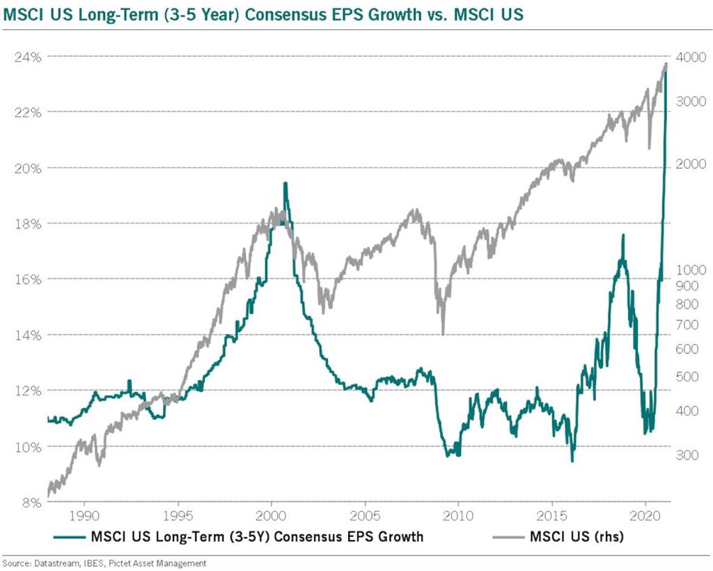
Source: Julien Bittel, Pictect Asset Management
Fixed Income
Well surprise, surprise. The 10 year shot higher last week and the 2 year didn’t budge. That’s the combination of continued ultra-accommodative Fed policy in the face of higher expectations for fiscal stimulus, growth, and inflation.
The long bond sell off continued last week, with US 10 Year yields rising +13 bps to 1.34%, its highest level since February of 2020 (bond yields and prices move in opposite directions). 10 Year yields are now sitting in a fairly ambiguous position. This rally of yields has brought us right back to the 2012/2016 lows, which acts as resistance (see Chart 7). A failure here could see the retest of prior lows, or a break above this resistance could propel us much higher to the long term downtrend. Again, ambiguous from a technical perspective. From an intermarket perspective, the copper-to-gold ratio vs. yields has become a popular piece of evidence used to argue that yields will move higher (see Chart 8). There is growing consensus that the next move for yields is higher, not lower (see Bloomberg article here).
Despite the improving growth backdrop, the Fed’s commitment to highly accommodative policy continues to hammer down the front end of the curve. 2 Year U.S. Treasury Yields were nearly unchanged last week. They have actually declined 2 bps YTD to 0.10%. This allowed the U.S. Treasury curve to steepen further, +13 bps to 122 bps (what is propelling Bank shares higher).
Chart 7: U.S. 10 Year Yields (long term, monthly)
After breaking out from short term downtrend (green line) following the Georgia Senate elections, yields have rallied to resistance 2012/2016 lows (horizontal red line)
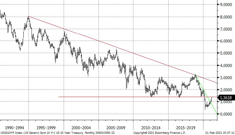
Source: Bloomberg, Fieldpoint Private
Chart 8: Copper vs. Gold (red line) and 10 Year Treasury (black line)
The copper vs. gold ratio is being used as evidence that yields will continue to move higher
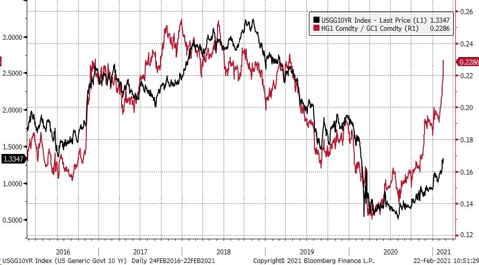
Source: Bloomberg, Fieldpoint Private
Currencies and Commodities
The USD fell slightly last week (DXY m-.06% to $90.36), continuing to consolidate in a tight range after it broke down through resistance at the end of 2020.
The rally in industrial metals continued last week given expectations that a strong economic recovery and a shift to new technologies will significantly increase demand for relatively supply constrained metal inputs (see Bloomberg article here for a helpful walk through of the “green” metals complex). Copper staged a large rally last week (+8%, +16% YTD). Multiple analysts are forecasting a deficit for copper in the coming years as the growth in demand outstrips incremental supply.
Last Week Economic Data: Strong Retail Sales and Manufacturing Data
Strong retail sales and producer prices stoked inflation fears last week.
Retail Sales
Retail Sales in the U.S. rose +5.3% in January (seasonally adjusted), much higher than the +1.1% gain expected by analysts. The year over year increase was +7.4%. The jump in retail sales was attributed to the $600 direct payments to lower and middle include consumers. Gains were experienced across a wide range of end markets including automobiles, electronics, online retail, building materials, furniture, sporting goods, and even restaurants (see Reuters article here).
The strong retail sales contributed to a sharp jump in the Federal Reserve Bank of Atlanta’s GDPNow Model, which jumped to +9.5% growth for 1Q21 from +4.5% growth the week prior (see Chart 9).
Chart 9: Federal Reserve Bank of Atlanta GDPNow Model Jumps to +9.5% Growth for 1Q21
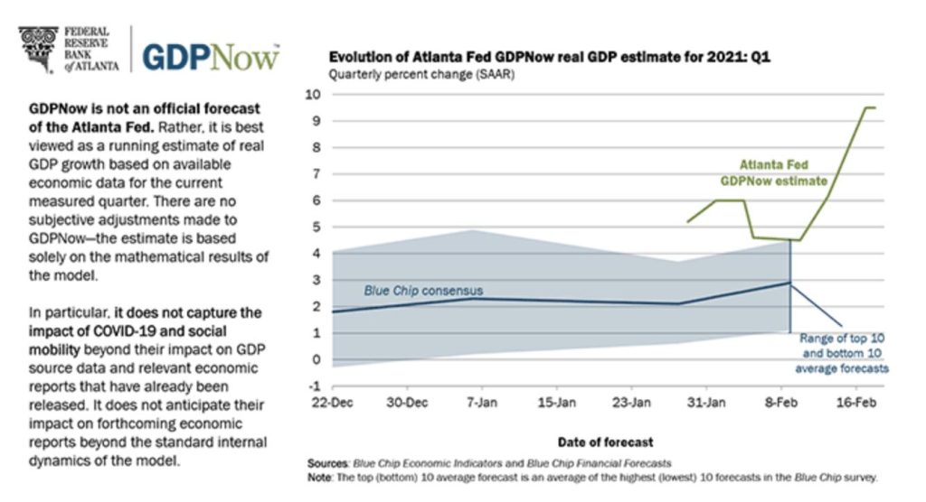
Source: Federal Reserve Bank of Atlanta
Manufacturing: Producer Prices and Industrial Production
January U.S. producer prices (PPI) for final demand rose +1.3%, the most since 2009 when the index began (see Reuters article here). This represents a +5.3% annualized rate since the index bottomed in April of 2020, and as Brian Wesbury of First Trust Economics Blog, this is significant because services have twice the weighting of goods in the index and had moderating prices to end 2020 (meaning goods price inflation is material). There are pockets of significant capacity constraints where price inflation has started to accelerate in recent months. For example, transportation and warehousing costs are rising at an annualized pace of +16.3% over the past three months. There is a shipper container shortage (see WSJ article here) that is pushing up shipping prices, and is also pushing prices for base commodities, which adds to producer price increases. The resurgence in end demand throughout the global economy and lasting supply constraints from the pandemic disruptions are starting to work their way into higher prices throughout the global manufacturing complex.
Industrial Production rose by more than expected in January (+1% vs. +0.9% in December and +0.7% cons, see Bloomberg article here ).This brings U.S. industrial output to just 1.9% below pre-pandemic levels (see Chart 10). This is interesting given consumer goods demand is well above pre-pandemic levels (services well below), which is one of the reasons producers are still calling out tight inventories). Included in the report was capacity utilization moving higher to 74.6% from 73.9% and O&G well drilling +11.3% MoM but still down 50% YoY.
Relatedly, U.S. Import Prices ex petroleum rose +2.6% YoY in January, the fastest pace since 2012 (see Chart 11).
Chart 10: U.S. Industrial Production
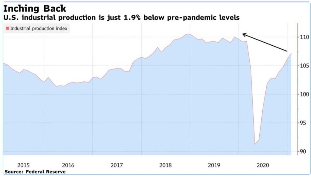
Source: Bloomberg, Federal Reserve
Chart 11: U.S. Import Price Index (ex petroleum)
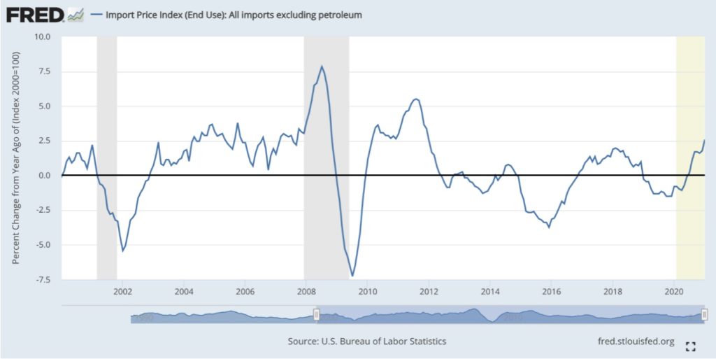
Source: St. Louis Fed Economic Data FRED
This Week Data
- Monday: Conference Board Leading Economic Index
- Tuesday: Case-Shiller Home Price Index; Consumer Confidence Index; US Federal Reserve Chair Jerome Powell testifies before Congress
- Wednesday: New Home Sales; 2nd day Powell Congressional testimony
- Thursday: 4Q20 GDP 2nd estimate; Weekly Unemployment Claims; Durable Goods; Pending Home Sales
- Friday: University of Michigan Consumer Sentiment; Personal Income & Consumer Spending
Disclosures
IMPORTANT LEGAL INFORMATION
This material is for informational purposes only and is not intended to be an offer or solicitation to purchase or sell any security or to employ a specific investment strategy. It is intended solely for the information of those to whom it is distributed by Fieldpoint Private. No part of this material may be reproduced or retransmitted in any manner without prior written permission of Fieldpoint Private. Fieldpoint Private does not represent, warrant or guarantee that this material is accurate, complete or suitable for any purpose and it should not be used as the sole basis for investment decisions. The information used in preparing these materials may have been obtained from public sources. Fieldpoint Private assumes no responsibility for independent verification of such information and has relied on such information being complete and accurate in all material respects. Fieldpoint Private assumes no obligation to update or otherwise revise these materials. This material does not contain all of the information that a prospective investor may wish to consider and is not to be relied upon or used in substitution for the exercise of independent judgment. To the extent such information includes estimates and forecasts of future financial performance it may have been obtained from public or third-party sources. We have assumed that such estimates and forecasts have been reasonably prepared on bases reflecting the best currently available estimates and judgments of such sources or represent reasonable estimates. Any pricing or valuation of securities or other assets contained in this material is as of the date provided, as prices fluctuate on a daily basis. Past performance is not a guarantee of future results. Fieldpoint Private does not provide legal or tax advice. Nothing contained herein should be construed as tax, accounting or legal advice. Prior to investing you should consult your accounting, tax, and legal advisors to understand the implications of such an investment.
Fieldpoint Private Securities, LLC is a wholly-owned subsidiary of Fieldpoint Private Bank & Trust (the “Bank”). Wealth management, securities brokerage and investment advisory services offered by Fieldpoint Private Securities, LLC and/or any non-deposit investment products that ultimately may be acquired as a result of the Bank’s investment advisory services:
Such services are not deposits or other obligations of the Bank:

− Are not insured or guaranteed by the FDIC, any agency of the US or the Bank
− Are not a condition to the provision or term of any banking service or activity
− May be purchased from any agent or company and the member’s choice will not affect current or future credit decisions, and
− Involve investment risk, including possible loss of principal or loss of value.
© 2021 Fieldpoint Private
Banking Services: Fieldpoint Private Bank & Trust. Member FDIC.
Registered Investment Advisor: Fieldpoint Private Securities, LLC is an SEC Registered Investment Advisor and Broker Dealer. Member FINRA, MSRB and SIPC.
Johnny Gibson
CFA®, Chief Investment Officer
Cameron Dawson
CFA®,
Chief Market
Strategist